| TL; DR | Top | The End |
Thoughts on Improvements
Just as an experiment, I’ve put some text inside the folder that defines this section of thoughts. I did it by typing in the Scrivenings mode, though there are other ways of doing it, I’m sure. I expect that it’ll compile just fine and this will show up as an introductory paragraph in this (big) section.
In the binder, the folder icon is now showing a little text indicator so that I can be aware there’s text in here.
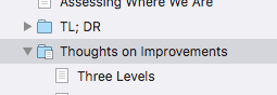
Three or More Levels
I suspect when I next use Scrivener in earnest, I’ll go to three levels instead of the current two. I’ll have something like Section, Chapter, and Paragraphs. I don’t know, I’ll need better names but the idea will be to allow for major sections with identifiable formatting.
Sometimes in fiction chapters (especially), there’s another breakdown, often indicated by a little graphical widget in the text. If I wanted that I’m not sure if I’d do it with an additional level, or perhaps just a new layout. I just have an inkling that there’ll be more to do.
In fact, I’m typing in titles like the one above, which is a pretty clear indication that I have in mind more structure than is presently defined in my format and layouts.
Auto Titles in Subs
Relatedly, I’m typing titles fairly often in some of these parts of the project that are in folders. Since I include titles automatically in my top level layout, and since I’m using them often in the lower level, this, too is evidence that I need a deeper structure, and perhaps automatic titles all the way down, or most of the way down.
I’ll evolve that as I go on with other writings.
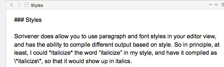
Styles
Scrivener does allow you to use paragraph and font styles in your editor view, and has the ability to compile different output based on style. So in principle, at least, I could italicize the word “italicize” in my style, and have it compiled as *italicize*, so that it would show up in italics.
I’m used to typing in plain text, and will probably stick with it, and I believe it might be difficult to set up otherwise. When I’ve set the mode in Scrivener that does that, it also escapes all my own markup, so I think I’d have to convert all the way.
Possibly, there’s another way to do it, by associating a compiled form with any styling I used. That would take experimentation, and since I’m comfortable writing my own markup, I’ll probably keep doing it that way.
You might wish to go another way.
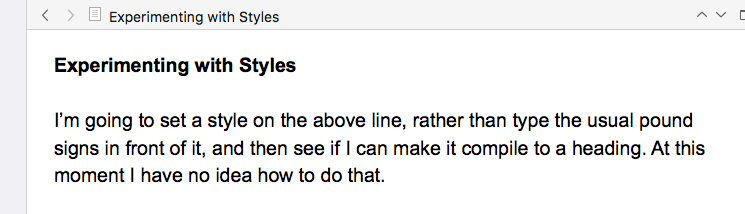
Experimenting with Styles
I’m going to set a style on the above line, rather than type the usual pound signs in front of it, and then see if I can make it compile to a heading. At this moment I have no idea how to do that.
I left some styles defined, so I’ve set the above line to Heading 2. I’ll compile to see what, if anything, it does. … The first result is nothing: it compiles as plain text. Time to do a bit of study.
Two quick learnings:
First, in compile, editing the layout, in the Styles section, you can associate prefix and suffix with styles. I’ve done it like this:
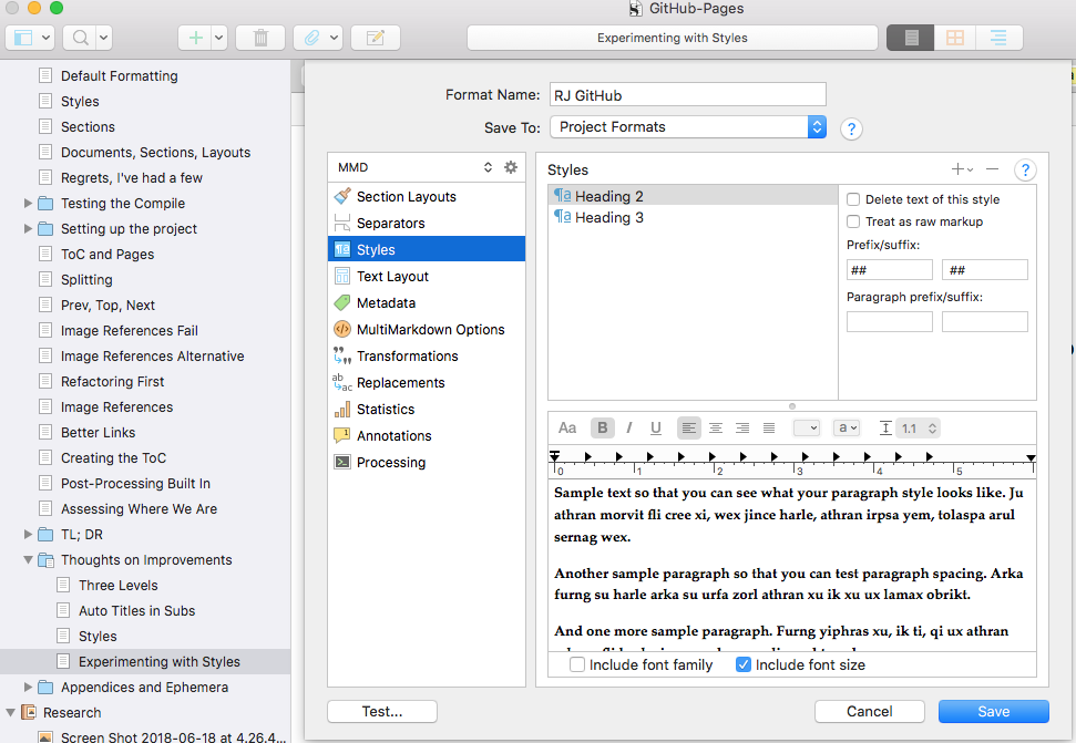
Note that I’ve set the first prefix / suffix panes, to pound-pound-space and space-pound-pound. I’m really not sure whether I should have used the second panes, Paragraph prefix/suffix instead but this worked, the line comes out with pounds around it as intended.
Since this section is compiled using level 3 headers, I then defined a level three heading style. I did that by formatting a line to bold 13 point, then the Format menu lets you define that as a style. Then I set the prefixes as above, but to three pound signs rather than two. And it compiles just as one would hope. So the top of this page looks like this:
On the preceding page, I’ve formatted manually with pound signs, like this:
I don’t know. I could get to liking that. The styles have shortcut keys, command 5 and such, so maybe I’ll try using them a bit and see how I feel about it. So far it seems I can use them interchangeably.
As another experiment, I tried marking the next three words as “emphasis”, and defined that style, in compile, to have prefix and suffix of asterisk (*) which makes for emphasis style (italic) in the HTML. As you can see above.
As I worked through all this setup and thinking, I find my understanding of Scrivener changing. I’ve mostly used two approaches to producing documents.
With Word, I used its styles to produce documents in the form they would finally appear when printed. I used headers and other formatting as I worked, to make the document look like I intended, as well as to say what I intended to say.
Later, building my web site with Wordpress and similar tools, and when writing XP Installed with PageMaker, I followed that same practice, creating content and format at the same time.
Still later, culminating when I moved my site from Wordpress to Jekyll, I began writing in Markdown. Markdown looks a lot more like plain text, though one does indicate headings and other layout with text-level markup, such as pound signs for headings, and stars to indicate emphasis, and so on.
Now Scrivener allows one’s working format to differ more greatly from the final display format. To a degree, this is always necessary, of course. If you can’t see on your screen whether something is a header or not, it’s going to be difficult to write. If you can’t tell the difference between emphasized text and regular, things are likely to come out looking strange.
But you can have your headers bold and centered in Scrivener and compile them to come out italic and right justified in the final output. Your working look and publishing look can be quite different.
Now it’s early days for me in understanding but it seems clear that for compiling purposes, I’ll want to change the look based on meaning. That means that while I might italicize a paragraph on the screen just to remind myself to rewrite it, in the published document I might want to italicize a paragraph only when it represents the contents of a letter received by the protagonist.
So in the first case, I’d just pull down the little Regular / Italic / Bold / Bold Italic thing up in the style bar, and in the second case I’d affix a Style, “Received Letter” or something meaningful. Scrivener would ignore the italics I put in from the style bar, and would look to my formats to decide what to do with a Received Letter.
There is another concern, in my case, at least for now. I’m going through Markdown. On the face of it, Markdown only has a very few semantic notions, and you might think there’s not much you can do. But that turns out not to be the case. You can embed HTML in Markdown, and it just passes through. And you can put prefixes and suffixes on the output of any styled item. Remember that we put pound signs on one of my items. Well, that could just as well be an HTML tag calling out some particular CSS, or the like. It could get ugly, but we could do it.
In addition, given that we’re committed to a post-processing program like my splitter, we could, with some difficulty, include some very complicated transformations, triggered by some very simple insertions into the output, in the way that I inserted <!–TOC–> to trigger the table of contents.
So, summing up this digression, I think I have learned enough to begin to feel comfortable working from the format and layouts we have here. I do think there’s more to say about project structure, and I’ll probably add another little chapter.
I really only have two levels of structure in this booklet, at this writing: 20180626:1028. Top level for “chapters”, and one level down, used for little index cards with short topics in them, kept in folders, like this:
The text on each of those cards is compiled into the project, and the card titles are not. You can see in the text there, that I’ve copied the titles into the text, or created new ones.
Now it seems to me that in writing fiction, or less episodic non-fic than this booklet, I’d like to use the cards to represent bits of the story, and maybe even move them around.
In addition, I’d probably like to have the book contain, I don’t know, sections, containing chapters, containing snippets or something. At least three levels makes sense. In fact, this booklet would benefit from another layer of structure.
I don’t know that I’ll change this booklet: I feel that it’s about done unless I learn something profound, which of course I hope to do and do not expect. But for the next project, I think I’ll start right out with three levels. What I’ve learned here gives me confidence that I can create a format and layouts that will compile it as I wish.
And that, perhaps, is the big lesson from Scrivener: you can view your work as you wish, and publish it in the form you wish, and it’s likely that you can make it do whatever you want.
The sub-lesson, of course, is that it may not be easy. However, it’ll likely be possible, and the best one can do is to create styles and formats that relate to the meaning of one’s work, and sort out the display details later.
| TL; DR | Top | The End |